Interior decoration color Feng Shui
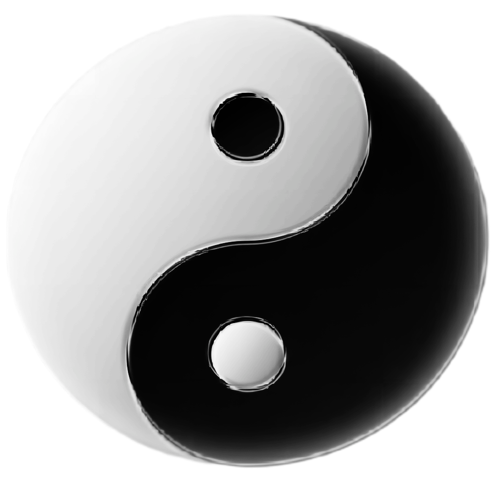
Colorful life is fun. According to the living habits of Chinese people, folk customs, beliefs and taboos, color matching should be considered, and colors such as black, pure blue, dark gray, medium gray and pure white should not be used as much as possible. This is the principle of Interior decoration color Feng Shui, which pays attention to Yin-Yang and five elements. Therefore, the use of indoor color should be consistent with the function of the room without conflict
Interior decoration color Feng Shui
Interior decoration color Feng Shui
Chinese people take red as the most auspicious color, indicating warmth, happiness, auspiciousness and strength. Yellow is a symbol of light, nobility, authority and longevity. For example, the main colors of costumes and palace decoration in the Forbidden City use golden yellow and vermilion to express nobility and authority
orange represents holiness. Traditionally, the monk’s orange cassock represents the supremacy of Buddhism. Green represents life, spring, tranquility and freshness. It is a commonly used tone in interior decoration. Indoor matching with green carpet and bonsai will make people calm. White and black indicate sadness and dullness
Fire: red and purple
soil: yellow and earthy yellow color system
Gold: white and milky color
water: black and blue
everything should be moderate, only the balance of yin and Yang and the collocation of five elements can be used. Overemphasizing one color may cause the imbalance of five elements. If it collides with the five elements of fortune, it will seriously affect the fate of residents
if the proportion of blue in the home is too heavy, over time, there will be gloom in the home, which will make people feel negative. Those with more purple in the home have a dazzling color sense; It is easy to make people at home feel helpless. If the proportion of green in the home is too heavy, it will lose the feeling of vitality of nature’s green life and make people feel tired
if the proportion of white in the home is too heavy, it will make people feel helpless and desolate for a long time
the excessive proportion of red in the home not only increases the burden on the eyes, but also tends to be irritable. The proportion of pink in the home is too heavy, which is the most fierce. Pink is easy to make people feel irritable, quarrel, right and wrong, and quarrel frequently
Interior decoration color matching knowledge
the best colors at home are milky white, ivory and white. These three colors are most suitable for people’s visual nerve, because sunlight is a white series, representing light and people’s heart. The eye also needs to be bright to reconcile, and the white series in the home is best equipped with furniture, and the white series also represents hope. Wood primary color is the best tone! The primary color of wood is easy to generate inspiration and wisdom, especially in the study. It is best to use the primary color of wood as far as possible. In short, all kinds of colors should not be too many, and the principle is just right
bedroom and living room, the color of the wall is light pink with a little yellow; The doors and curtains are goose yellow, pink and light cream, which will create a comfortable and bright atmosphere
walls of dining room and children’s room; First use light cream, doors and curtains and colors are light cream and slightly yellow pink. This collocation will give a lively atmosphere
the color of the wall in the colder room facing north and the room with poor daylighting. Cream color system can be selected, and goose yellow can be selected for doors and curtains. This cooperation makes the room look and feel bright. In the study or studio, the color of the wall can be green system and other light colors. The color of doors and curtains can be green system and other light colors
the color of doors and curtains can be light pink and other light and bright colors first, which gives people a quiet and comfortable feeling
the color of kitchen walls should be milky white and other light and bright colors. The doors and curtains should be green system and other light and bright colors to give people health and vitality
